A swoosh, a mermaid, the golden arches - some logos are so iconic that they are instantly recognizable across the globe. But a great logo doesn’t just say who you are, it says what you are too.
As a result, the decision to change your logo is not one that organizations should undertake lightly. And yet, over the past 12 months, major companies ranging from donut chains to television channels have taken the leap by rebranding their looks.
But who did it best and what can organizations learn from these new-look logos? Join us as we find out by looking at 10 of the biggest brand logo designs of 2018.
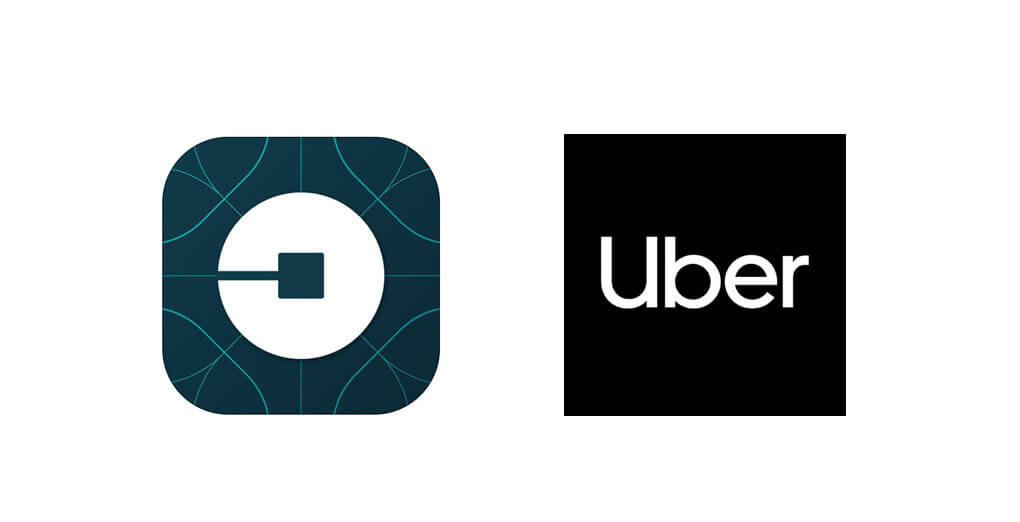
In an attempt to remedy the confusion about “where the U went” from the old greyscale icon in the ride-sharing service’s 2016 rebrand, Uber has refreshed its logo again. In doing so, Uber has moved away from its controversial symbol and reverted to a new wordmark logo to bring back the universally recognized U to the brand iconography, including Uber Eats, and to provide the framework for its marketing material and visual identity.
Black and white, set at a high contrast, and including a custom typeface, Uber Move features prominently throughout all of the company’s branding to provide a seamless system from text to icon, creating a single global brand.
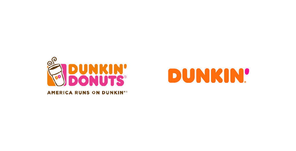
Dunkin’ Donuts is dropping the sweet treats from their name, rebranding to just Dunkin’ in order to shift perceptions of the brand away from a mere “morning coffee stop” to an “anytime-of-the-day, on-the-go brand.”
This is a logical extension of their tagline: “America runs on Dunkin,” and also brings the brand into line with what customers are already calling the chain. Whilst continuing to embrace the Dunkin’ heritage with its familiar colors and iconic font, first introduced in 1973, Dunkin’ is evolving its drinks range and expanding its food menu to attract a younger audience to its all-day offering.
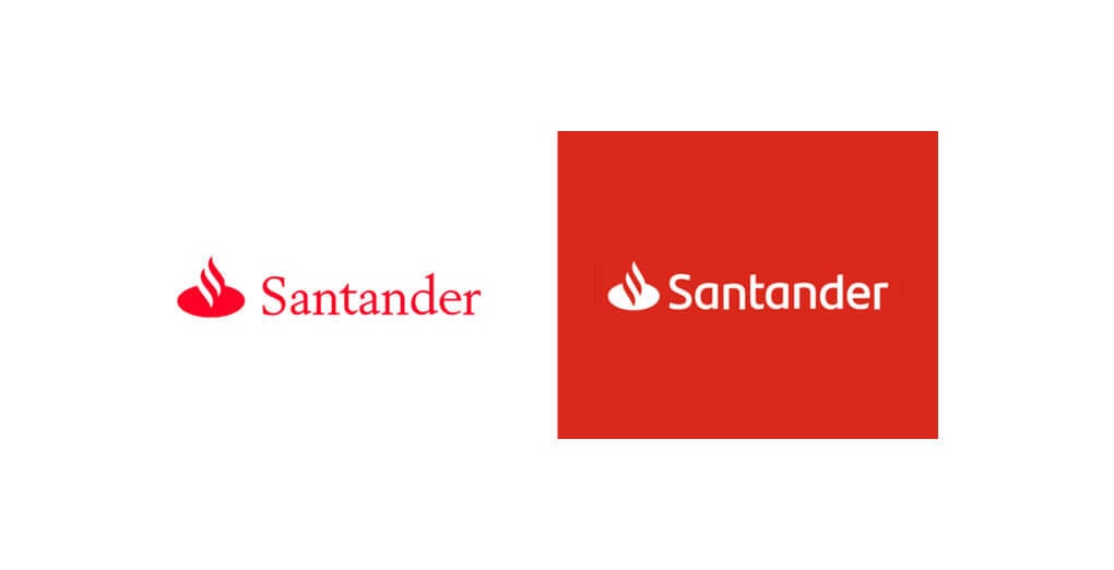
Santander is following the current rebranding trend in the financial sector with an update of its own logo, to underpin the bank’s transition towards digital and create a single brand identity in all markets. The rebrand has been introduced to provide a modern, highly visible image for digital channels. This echoes the change taking place within the bank’s corporate culture, and is designed to complement their shift towards the new digital lifestyle, which demands ease and speed.
Santander has not strayed too far from its core identity with the new logo featuring a simpler and cleaner font and a stronger red. The rebrand has given the flame a greater presence which has further increased the logos ability to be more adaptable to digital formats.
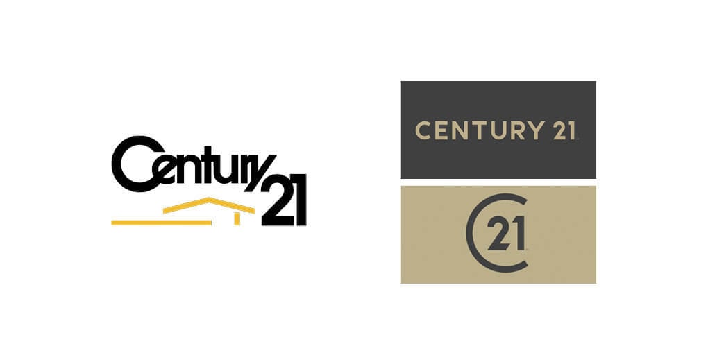
Century 21 has introduced a new brand identity to give a bold and modern take on the existing logo, intended to signify Century 21's “big, bold, ambitious moves ahead” for the broker network and affiliated agents.
The new logo features a refreshed color palette that stays true to its iconic gold and black scheme, while also embracing new graphics and a new “C” monogram. By eliminating the complexity and dated iconography of their previous incarnation, the new identity enables the brand to project a modern view that makes it relevant to consumers. The design also helps agents and brokers ‘break through the clutter and noise’ by projecting their own style and personality under a timeless ‘gold standard’ seal of approval.
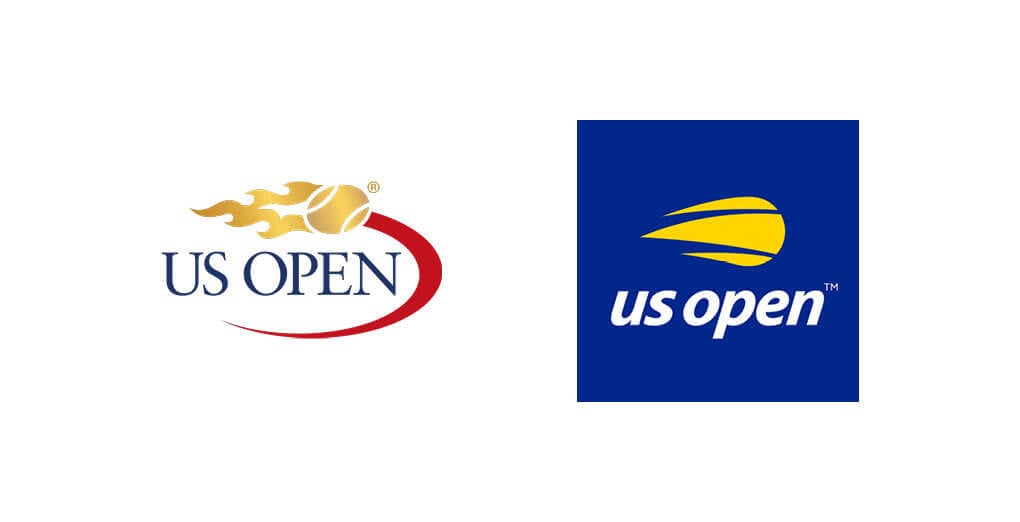
The United States Tennis Association’s (USTA) 50th Anniversary of the US Open has been accompanied by the launch of a bold new logo. The new look features a modern, streamlined version of the tournament’s flaming ball, and the thin-serif logo first introduced in 1997.
The bold, new logo consists of a strong blue backdrop, a simple sans serif and all lower-case text. But perhaps just as important as what has been added is what has been removed. The golden-flamed tennis ball is gone and so is its trippy red tail, which has been replaced by a contemporary clip-art style tennis ball. Together, with the completion of the Billie Jean King national tennis center, the new facility and logo are part of the USTA’s five-year transformation, aimed at creating a new visual, modernized identity for the tournament.
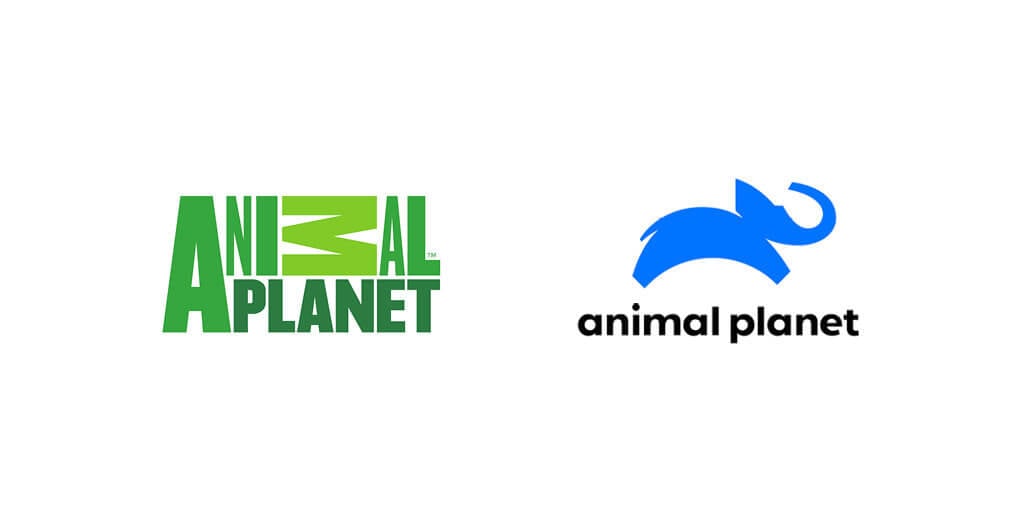
TV Channel Animal Planet is a much-loved brand that’s engaged with audiences across the globe for more than 20 years. Reaching all generations through content and storytelling, Animal Planet needed a new logo ‘that translates across countries, regions and cultures and beyond linear’ to represent the global aspect of the brand.
The core concept of the new Animal Planet logo is an elephant with the globe. A majestic, exotic, and intelligent animal, the elephant is wondrous enough to represent the entire animal kingdom. That makes it an appropriate choice for a brand looking to generate recognition and affection. As a result, in this fresh and distinctive rendition, the new leaping elephant captures the joy and energy of the beloved Animal Planet brand.
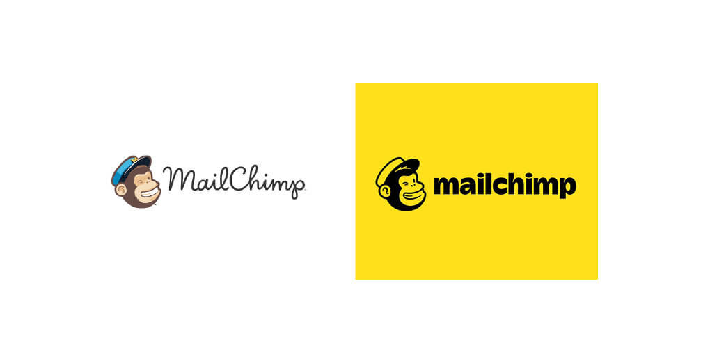
In partnership with Collins, the MailChimp logo has undergone a rebrand evolution, achieving yet again “a balance between the sophisticated and the surreal.” Mascot Freddie the Chimp has been retained from the original branding, but now appears alongside a new bolder-crafted typeface to work as a simplified mark. Freddie maintains his spirited cute and cheeky look, but there have been adjustments to simplify his look with more basic features, no “M” on his cap and less fur. The script has also been streamlined, replaced by a unique wordmark that maintains personality and delivers with impact.
The logo sits on banana yellow and bucks the current trends of muted softer tones and cooler colors in this category. As MailChimp themselves put it, ‘this new brand embodies so much of what is important to the MailChimp team — a devotion to craft, a love of creative expression, and an obsession with quality’. Through the brand’s evolutions, it has retained the elements that endeared the brand to its first fervent fans, whilst creating space for MailChimp to grow and speak with greater authority to a wider audience.
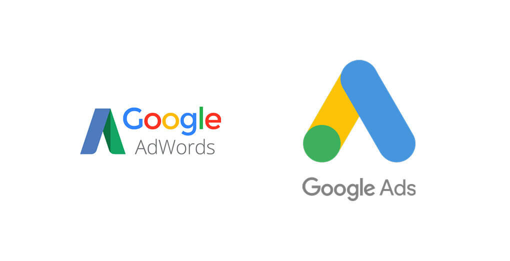
Google Adwords became Google Ads earlier this year with the platform’s name change accompanied by a new logo. The aim of the new brand is to help advertisers and publishers of all sizes choose the right solutions for their businesses, making it even easier for them to deliver valuable, trustworthy ads and the right experiences for consumers across devices and channels.
“The underlying products are not changing,” said Sridhar Ramaswamy, Senior Vice President of Ads & Commerce at Google upon the new logo’s release. “This is a better representation of what our products are and more importantly where they need to go.”
Particularly interesting is Google’s decision to drop “words” from the logo. The new name represents the full range of advertising capabilities Google offers, whether that’s search, display ads, YouTube videos, app ads in Google Play, location listings in Google Maps or elsewhere.
In an effort to align the product offerings into one unified platform, Google wants to give advertisers a single hub to manage activation, measure performance and find insights. With that in mind, this streamlined logo update is designed to echo that, simplifying and clarifying Google’s positioning as a marketing technology platform.
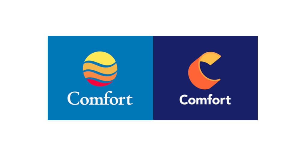
The new Comfort logo reflects the brand's warm and welcoming heritage and its properties’ refreshed, modern look and feel. According to Anne Smith, VP, Brand Management & Design, “It’s more than a change of symbol, it’s a symbol of change.”
The brand began the transformation of its properties in 2012, introducing new lobbies and upgrading guest rooms, and Comfort hotels are being renovated across the country to deliver a more consistent, up-to-date guest experience. Over the same period, Comfort has become the largest 100% smoke-free hotel brand in North America and these efforts have combined to strengthen the brand’s leadership position in the upper midscale segment.
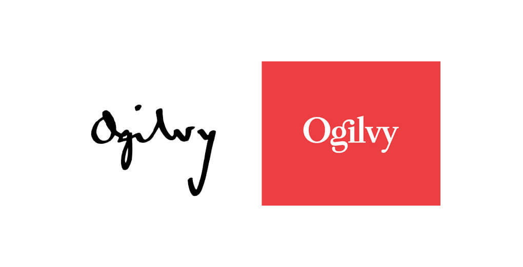
Working in conjunction with the design agency Collins to bring together the OgilvyOne, Ogilvy & Mather Advertising and Ogilvy Public Relations names over a two year period, the new integrated Ogilvy brand now represents one unified group.
The new visual identity system has its roots in Ogilvy history with the logo embodying a 21st-century wordmark design derived from the original handwritten logo, that was born out of the signature of founder David Ogilvy.
One of the biggest trends among 2018’s rebranded logos is a move towards simplified, clean wordmarks. This is becoming the new norm for logo aesthetics due to its transferability and its ability to work across a range of digital platforms.
In today’s ever-changing digital landscape brands are looking to cut through the noise and clutter that consumers are faced with online. As a result, they are using their logos to create their own clean space that stands out from the crowd and delivers instant recognizability.
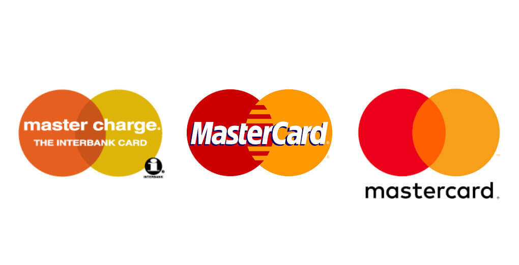
The clean lines, simplicity and high visibility you see dominating the branding landscape right now are all key to achieving this. At the end of the day, it all comes back to design. Great visuals are a must in order to stand out from the crowd. But a logo doesn't just need to attract attention, it also has to communicate who you are and what you do.
That’s why logos are just the tip of the iceberg when it comes to branding. Indeed behind every one of these rebrands is a carefully thought out strategy that’s designed to drill down to the essence of each organization and communicate it at every opportunity.
Major Tom exists at this nexus where art and science meet. As a logo design agency, our team of experts located in New York, Toronto and Vancouver don't just create stunning visuals that help organizations to stand out, they create holistic identities that work across all of the touchpoints you’ll find in today’s constantly evolving marketing landscape. If you’re considering a logo rebrand, get in touch with our experts who will be happy to talk about the ways in which we can change the conversation around your company.
Receive exclusive action-focused content and the latest marketing insights.