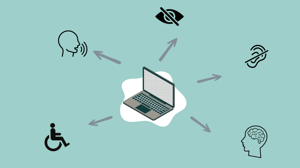
Web accessibility isn't just a best practice—it's essential for crafting a truly inclusive digital world. This idea goes beyond the basics, aiming to ensure that everyone, regardless of their abilities or the technologies they use, can access and benefit from online content. From users navigating with assistive technologies to those relying on keyboard commands, an accessible website means no one is left behind. But achieving this level of accessibility involves more than meets the eye.
As we explore further, it becomes clear that creating an accessible website is a multifaceted challenge involving various stakeholders and continuous commitment. Here are five key insights that illuminate the complexities of web accessibility and guide you through the essential practices necessary to make your website truly accessible.
1. Web accessibility isn’t just alt-tags
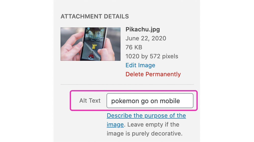
A lot of people are familiar with this best practice. Ensuring that all of your images on your site have alternative text with the use of an alt attribute is a great first step with web accessibility. The guideline is an easy concept, make sure all images that aren’t for decoration have an alt tag describing what the image means to convey.

This is just a small piece of the puzzle for building an accessible site though, in fact, it’s a very small slice of the accessibility pie. There’s a whole host of other guidelines and criteria you can take a look at on the WCAG quick reference guide for web accessibility. So much so, that becoming an expert in web accessibility takes time — it’s no small feat.
2. It’s more than just the developer’s job
As discussed, there’s a lot to consider when thinking about web accessibility. A good amount is the responsibility of the web developers creating the site, but to achieve solid accessibility you need all members of the team involved: UX designers, UI designers, content creators, and developers. Web accessibility needs to be considered and prioritized from the very beginning of a project in all aspects if you want to have an optimal end experience on your website. Knowing this at the start of a project is ideal so your team can plan appropriately.
%20(1)%20(1)%20(1)%20(1)%20(1)%20(1)%20(1)%20(1)%20(1)%20(1)%20(1)%20(1)%20(1)45c8.png)
If you’re considering a new website you may want to check out our Attention-Grabbing Website RFPs That Get Quality Responses blog post for more information about what to include when you’re writing your RFP.
Choosing the path for a more accessible site is an investment — considering roughly 1 in 5 people in North America have a disability, the investment is a sound one. A better experience for a large percentage of your target audience will have return benefits.
3. There’s no clear cut way to fully achieve web accessibility
There are numerous ways to achieve some of the criteria around web accessibility, especially from the WCAG. On one hand, this is a plus, as it means you aren’t limited with how you implement or set up your site and layout. The drawback is that it makes it difficult to tell exactly if your interpretation of a guideline will successfully pass a guideline’s specs.
Another tricky thing about some web accessibility guidelines is that often, the success of your implementation is contextual and greatly depends on the situation itself. The alt-text guideline I described above is a great example. Context is everything when it comes to having valuable alternative text for images, this great article about alternative text from WebAIM elaborates on the subject — it also involves a quiz (don’t be discouraged — I failed it the first time that I did it).
It may be hard to understand the correct solutions for each case and this brings me to my next point:
4. There’s no easy way to test accessibility
There can be multiple correct ways to do the same thing, unfortunately, it’s not as simple as running your website through an automated accessibility checker like WAVE to know if you’ve done it correctly. Automated testing tools can accurately test sites for roughly 30% of web accessibility guidelines. This is due to the fact that a lot of the guidelines are not simple yes or no checks (for example, an automated tool can test whether all images have alt-tags, but it can’t test if it should be empty in the case of a decorative image). Don’t get me wrong, automated tools are a great place to start when you want to assess where your site is starting at. Just keep in mind they are not a holistic summary of your site’s level of accessibility.

You also can’t test for accessibility based on web designs alone, although it’s ideal to start testing (looking at color contrast, font sizes, etc.) during this phase.
To get the most accurate answers on how accessible your site may be, you need auditors to test your site. This makes sense if you think about it, similarly to how you will have a more informed hypothesis around a design if you take the time to do user testing and research. When I say there’s no easy way, I mean that testing for web accessibility takes a time commitment. You’ll want to find accessibility testers or auditors that are familiar with web accessibility guidelines, who may have disabilities and are versed with assistive technology.
5. Accessibility work is never finished
Much like a website, there isn’t a point during a website project where accessibility work is finished. A website and its content should always be evolving, it’s the same with accessibility. We have a saying at Major Tom, “Websites are like gardens, not castles”. They require upkeep and maintenance to stay relevant and refined. Continuing to dedicate time towards accessibility improvements on your site and your content will ensure the most consistent experience for everyone.
If you need support learning more about web accessibility, get in touch with us today.
Legal Disclaimer: The content on this site is provided solely for informational purposes. It is no way, shape, or form to be taken as legal advice, it’s based on our own research. If you do need legal advice, we strongly recommend consulting a lawyer.