Your website is the ultimate salesperson, working tirelessly 24/7 to attract, engage, and convert visiting users into loyal customers.
But what happens when this lead-generating dynamo starts underperforming?
Instead of propelling your business forward, it becomes a stagnant online brochure that will fail to captivate and convert.
It's a frustrating reality that many businesses face. Having seen this problem time and again, we understand the chaos an underperforming website can create.
That's why we're sharing tactics that drive results and transform even the most complex lead-generation websites into powerful growth engines.
This isn’t just about building a great website for today. It’s also about incorporating an approach that will help your site evolve and continuously generate more leads over time.
Let’s start at the top.
Understanding your website's current performance — and its shortcomings in terms of lead generation — is crucial for making informed improvements.
That remains true as your site evolves over time. Putting a reliable, effective process in place now will help you evaluate the site’s performance and problems throughout its lifespan — and pay dividends in the long run.
Begin by conducting a comprehensive audit to examine key performance metrics, including page load speed, user engagement, conversion rates, and bounce rates. Free tools like Google Analytics and Hotjar can help you do this without additional upfront costs. The qualitative and quantitative data they provide will give you new insights into your users’ behavior and help pinpoint areas that might be creating friction in the user journey.

The larger and more complex the site, the more critical this step is. That’s especially true if you need buy-in from multiple stakeholders, and can leverage the audit data to make the case for an update. This analysis will enable you to identify specific issues and areas for enhancement, paving the way for a more optimized and effective website.
Major Tom’s two-part series on identifying and improving UX issues can give you a better sense of what this audit might look like. But there are some common issues that you’re likely to encounter.
From outdated pages to inaccessible design, there are a few likely suspects to investigate if your website’s performance has been suffering.
Think of these as hurdles between your audience and your conversion goals. Alone, each issue probably isn’t a deal breaker. But as they add up, it’s less and less likely that any given visitor will turn into a new lead.
After all, streamlining your users’ path to conversion takes a holistic effort across your site.
For starters, you should look for:
If your website is a user’s road to conversion, then its user experience (UX) is the state of the blacktop. Unoptimized UX elements are like cracks that make their journey more turbulent, or potholes they’ll have to swerve to avoid. Each one is an additional annoyance, and once there are too many, they’re likely to leave the road entirely.
To help turn visitors into leads, pay particular attention to your:
Your users’ time is precious, and they’ll feel annoyed (if not outright disrespected) if your site wastes it with long load times and sluggish transitions. It’s a sour note that will make every step of their user journey hard — maybe even compromising your ability to nurture them as a lead.
To keep the successful conversions flowing, be sure to check your site’s:
This is it. The big milestone where a user submits their information, or requests a sales call, or buys into whatever your business has to offer them. So what if they’re ready to convert and can’t find a contact form? Or aren’t sure what clicking the big button at the bottom of the page will do? If you’ve already brought a visitor to the point where they’re ready to convert into a lead, you need to make that next step as easy as humanly possible — with a clear, explicit, and well-placed call to action.
Be sure to check your CTAs’:
If you’ve addressed the above and still feel like your lead-generating website is underperforming, there are a few other common obstacles that might be standing between users and the conversion to leads.
Over time, these process issues will have repercussions for the user experience across your site. Once that happens, users are less likely to trust the website and may seek alternatives. That means more missed opportunities and decreased conversion rates.
Even worse, if they’re left unaddressed, these problems can damage your brand perception and impede your ability to nurture leads into loyal customers.
Be sure that you’re not:
Addressing these factors through systematic audits and targeted improvements will set the groundwork for a high-performing lead-generation website that drives sustained business growth.
Creating a standout lead-generating website, especially for large and complex sites, demands a strategic approach. Now that you've found the root problems through your audit, it’s time to set SMART goals to know where to focus your efforts.
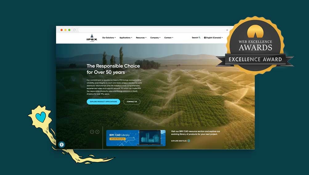
Identifying the right areas for improvement will help drive transformative growth across your site — just look at our work on the award-winning site for IPEX, a construction industry leader in integrated piping products.

How do you know which SMART goals are a fit for your site? It all begins with a better understanding of your users’ needs.
First, understanding your target audience(s) is paramount. Be ready to test your assumptions about visitors (and abandon them, if necessary), and dive deep into user research to understand their needs, preferences, and pain points.
We recommend gathering data from the following sources:
These tools will help you better understand what, exactly, users are looking for on your site. Tailoring the website experience to address these specific needs will significantly enhance user engagement and conversion rates.
“Empathy Mapping” is one useful tactic for turning this data into meaningful audience insights. It focuses on mapping responses from your research to four areas of a user’s experience: what they say, what they do, what they think, and how they feel. Then, identify contradictions between the four quadrants — and use those contradictions to identify some of your users’ needs.
For example, suppose surveyed users say that they’re visiting your site for educational content, maybe in the form of a blog. But when you look at your heat mapping and analytics, what they’re doing is bouncing from the blog index page at a high rate. With this disconnect, you’ve identified one need: a system that helps users better navigate your blog posts and find the information they’re looking for. Maybe that means improved sorting, overhauling the design of the index page, or adding more thorough interlinking between blogs to help them find relevant content as they read. By identifying more of these gaps and inconsistencies in user feedback, you’ll better understand some of the current issues with your site.
Whatever approach you take, we highly recommend updating persona profiles periodically. Your audience will continue to evolve, and by reevaluating your user personas on a regular basis you can ensure your website continues to evolve alongside them.
With your user research and personas prepared, you may be wondering how to turn them into actionable improvements for your site.

Remember, though, these personas aren’t static. As your site and your customers continue to evolve, you should revisit and optimize this research to keep your understanding of your users and their needs up to date.
For now, and with an eye for improving both business and usability outcomes, you can begin by focusing on a few critical elements of your website:
Your website should feel like an intuitive and welcoming space, not a confusing maze. Remember, bad UX is bad for your business, too.
With your comprehensive user research in hand, you can begin to map out a streamlined user journey that fits your audiences. Are they looking for educational resources before they buy? Or perhaps you have multiple, distinct audiences who will navigate your site very differently? No single approach will work for every site, so be sure you keep users’ needs in mind.
Develop a clear approach to navigation, and ensure that the information hierarchy is clear on every page. Don’t forget to implement a mobile-responsive design that caters to today's tech-savvy audience.
Of course, the more audiences you have, the more important it is to clearly understand each user journey.
As an example, consider our work with Layfield. With two distinct lines of business, they needed a clear brand and website architecture that would organize a wealth of information and help users easily reach their destination on the site.
No matter how complex your site is, you should strive to make UX invisible. That means building a journey that feels like it’s been curated specifically for each user. If you truly understand and address their needs, the experience of using your site will be frictionless. If you don’t, your attempts to guide them to different conversion points will be ineffective and intrusive. So remember to always design with the user in mind.
Usability testing methods like card sorting and tree testing may also help improve information architecture, ensuring users can easily find what they require.

Of course, you also need to ensure your site is properly accessible — or risk alienating visitors as soon as they arrive. If you’re not familiar with what makes a website accessible (or not), start with our five essential dos and don’ts.
As you work, remember that the strongest user experiences aren’t built overnight. Taking an iterative approach to UX lets you continuously improve your user experience based on regular feedback, testing, and persona updates. Apps often follow this methodology, releasing frequent updates to enhance functionality and address user needs.
Optimizing your website for search engines is crucial to increase website traffic.
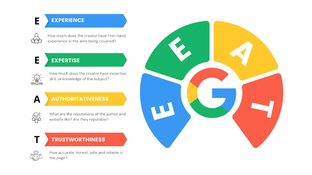
Do thorough keyword research and use these insights to support your content strategy. Tools like SEMRush help you analyze your website's performance, track keywords, conduct competitor analysis, and optimize your SEO strategy effectively. Make sure technical SEO elements, like meta tags, alt texts, and sitemaps, are in place. You also need to be aware of how search engines like Google evaluate your content — using their E-E-A-T guidelines to establish quality and authority, for example.

These SEO efforts will your content strategy immensely. And remember, when it comes to winning SEO, you can’t set it and forget it. Ongoing optimization is the name of the game, especially as search algorithms evolve, your users’ search queries (and intent) change, and the state of your industry changes with it. Keeping your pages ranked takes ongoing tune-ups — and a deep understanding of the state of SEO.
High-quality, engaging, and tailored content is the lifeblood of any successful lead-generation website.
Focus on creating content that addresses your target audience's pain points and interests, which you can identify with your customer and SEO research. Implement topic clusters and E-E-A-T (Experience, Expertise, Authoritativeness, Trustworthiness) principles to follow the latest best practices and improve search engine visibility.
You can also experiment with dynamic content blocks that personalize each user’s experience and make your website more engaging. Personalized content can really sway user decisions. Leverage data to send targeted messages and offers based on user behavior and preferences. Adding dynamic content blocks that adapt to visitor segments can make your website more relevant and engaging for each user.
With all of that said, remember to write content for readers, not for the algorithm. While SEO is crucial for your content’s visibility, trying to game the system with keyword spam, or content that doesn’t actually offer useful information for the reader, will lead to more bounces and harm your ranking in the long run.
Data analytics is pivotal in driving website improvements and personalizing user experiences. It helps you test your assumptions, learn more about how users actually behave, and keep up with evolving audience expectations.
Google Analytics 4 comes in handy here, helping you track user behavior and conversion paths. We recommend building a Measurement Framework to track site performance so you can make data-driven decisions that boost site performance.

Implement A/B testing to experiment with different design elements, CTAs, and content to identify the most effective strategies for maximizing conversions. When you do, be sure to test for long enough to generate meaningful insights — a few days’ worth of data won’t always be enough to draw useful conclusions.
We may sound like a broken record, but this point can't be emphasized enough: you need effective CTAs for your audience to convert. Strategic CTA placement is the art of gentle persuasion, guiding users toward conversion with clear and compelling CTAs that resonate with their needs.
Ensure that each CTA is clear, aligned with the content, and placed in highly visible locations. Whether it’s a newsletter signup, a demo registration, or a contact form, you want to be sure it connects to the page and the content that the user is looking for.
When building your high-quality lead generation website, consider both current and future needs to avoid frequent rebuilds. Consider your business goals and whether your site’s technology can help you achieve them without another costly web overhaul.
Scalable technologies ensure your website grows and adapts as your business evolves. Choose a flexible and scalable content management system (CMS) that lets you integrate various external systems and manage data across platforms efficiently. Even if you aren’t taking full advantage of your CMS’s flexibility now, having a system that will grow with you can reduce headaches in the long run.
Explore automation and artificial intelligence (AI) to see if they can help boost your website’s functionality and user interactivity. For example, chatbots can cut wait times and answer basic user queries, while AI-powered product recommendations personalize the shopping experience based on previous customer purchases.
A website is a living, "breathing" entity that requires ongoing care and attention. As a crucial part of a healthy sales pipeline, websites that focus on lead generation need even more. As such, you shouldn’t treat these improvements as a one-and-done overhaul for your site.
As your website continues to gather more and more data, make sure you're actually leveraging the insights it provides. You should continue to update content, design elements, and functionality based on user feedback and analytical insights.
Again, really make sure you lean into your analytics, A/B testing, and ongoing user research.
With this level of care and attention, your site will continue to generate leads more effectively, offering you a long-term competitive advantage.
Feeling overwhelmed? Our blog on solving complex website usability issues for large-scale organizations can help you navigate the challenges ahead.
Receive exclusive action-focused content and the latest marketing insights.