Website usability has a complexity problem. The more your organization grows, the more confusing your website can become. To ensure your customers’ online experience remains seamless and frictionless, it’s important to develop a scalable information architecture that prioritizes website usability, design, and performance.
The organic growth of a website over time is a beautiful thing. Unmanaged growth? Not so much.
This blog will walk you through:
As your company grows, website usability becomes more complex and harder to navigate — internally and externally. Neglect it, and you’ll feel the repercussions on your employees, customers, and bottom line. It’s why smart organizations seek to improve their website regularly.
Regular website maintenance means you’re on top of your site’s usability. This is important, since 60% of consumers consider usability as one of the most important design characteristics of a modern website.
Website usability measures the ease with which your users can achieve their goals on your website. In other words, it’s a key indicator of a website’s effectiveness. It’s primarily evaluated by:
We’re in the era of digital marketing and you already know things move fast. What’s possible is constantly evolving, so your website should, too. Especially if you want to avoid the common web problems that most businesses face somewhere along the way.
Common web problems with easy fixes can have a huge impact on website usability. Each one has the potential to individually or collectively undermine a website’s effectiveness. This can lead to:
Let’s break these web problems down so that you understand when it’s time to revitalize your website and how to improve website performance.

Business growth happens. When the functionality of your current website no longer supports your business goals or your customers' needs, it's time to take a good, long look at its current state.
Externally, poor functionality makes it harder for users to complete tasks on your website, such as making a purchase, searching the site, or submitting an online form.
Internally, it could mean an old content management system that makes it difficult for multiple user groups of employees to access or update the backend.
Great website functionality will save you time, make your employees' jobs easier, and improve the user experience for your customers.
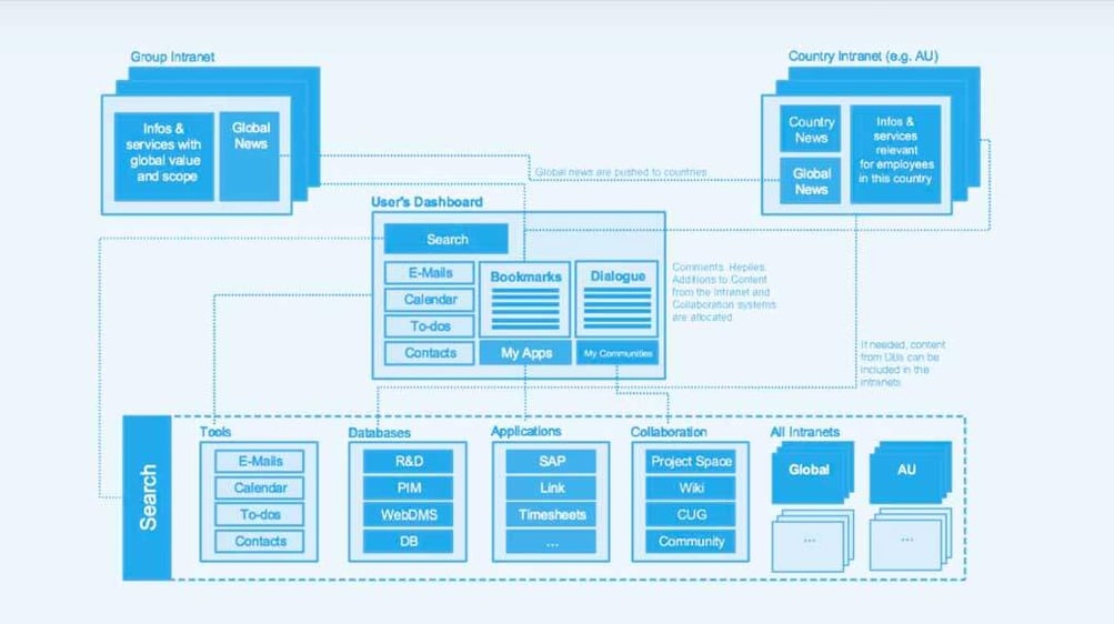
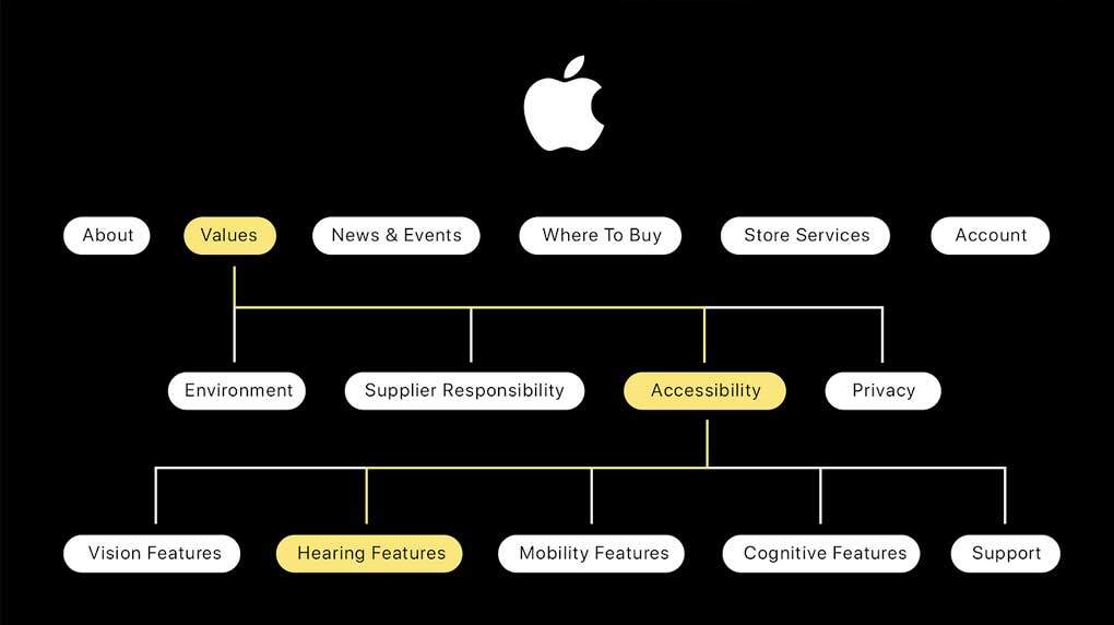
When your website's structure doesn’t keep pace with your company’s growth, it’s easy for unrelated content to get arbitrarily linked together, user journeys to have longer-than-necessary pathways, or worse, lead to a dreaded 404 page.
In these situations, not only are users unable to find what they’re looking for, but it’s also difficult for Google to index your site. A well-organized site structure with an intuitive user flow helps visitors, and Google’s search engine, understand the website’s content, making it easier for them both to use. The more natural it is for customers to hit that ‘check out’ button, the better. Plus, the higher you are on Google’s SERP, the more eyes you’ll get on your business.

Poor UX can take many shapes and forms, so it’s important to be able to identify bad user experience when you see it. It includes everything from:
Basically, anything that makes your website challenging to navigate. When users can’t find what they’re looking for, your business is the one that misses out on opportunities.
There are other ways bad user experience can hurt your business, too.
The problem is that poor UX doesn’t prioritize users' needs and goals. Great UX, on the other hand, uses intuitive logic to eliminate friction, confusion, and frustration. Its goal is to make the user experience as simple and efficient as possible. This, in turn, makes it easier for users to accomplish what they set out to do on your website—like buy a bulk order of your newest product.
Confusing navigation pushes users’ brains to a level of cognitive overload that’s so overwhelming it makes decision-making harder. It’s one of the main reasons why users end up bouncing from a website. In fact, 42% of people would bounce from a website solely because of poor navigation functionality.
Intuitive navigation breeds smarter website usability. Minimizing extraneous cognitive load lets people focus on what’s important — the reason they visited your site in the first place. Also, you should strive to always give your customers the kind of navigation they really want — as few clicks as possible to their intended destination.

Website accessibility issues prevent individuals, specifically those with disabilities, from accessing your website. You never want paying customers to feel confused, isolated, and distressed when visiting your website, you want them to feel able and equipped to accomplish tasks.
Accessibility issues also mean you’re not reaching as much of your market as possible. Resolving accessibility issues isn’t just about creating alt-tags; it’s about enhancing the user experience by keeping inclusivity top of mind. In other words, make your content accessible to as many people as possible.
The good news is: Great website accessibility means more visitors, more clicks, and, ultimately, more business. Win, win, win.
The modern world is busy, nobody has time for subpar website optimization. If your site takes too long to load, it frustrates people, they leave, you lose sales, and your website performance metrics go down.
Slow-loading pages are one thing; responsiveness is another. A website that isn’t optimized for mobile devices is much harder to navigate on a small screen; images are too compact to see, and text is too tiny to read.
According to Google, more than 50% of people say they won’t consider purchasing from a brand that has a poorly designed mobile site. Even worse, a poor mobile UX experience drives people away from your website, quickly. With more people accessing the internet on mobile devices than ever before, a mobile-responsive design is crucial for website usability success.
“But how can I know if my website is up to par?” you ask? We've created this handy Digital Marketing Assessment to help you understand if your website is optimized and, ultimately, marketable.
Plot twist: Customers are people, and, like all humans, their wants and needs evolve over time. Plus, with rapid technological advancements and shifting customer expectations, their needs are becoming much more dynamic. The truth is, your website needs to keep up.

After all, your website should be shaped around the people who use it most — your target audience. The best way to adapt your website to your customers’ ever-changing needs by asking them what they want. Surveys, interviews, and user-acceptance tests (UAT) are all great ways to get a beat on what your customers are really looking for.
Sorry to be the bearer of bad news, but if you're experiencing all these challenges, you've likely reached the point where your website is simply outdated.
Things like old, irrelevant content, broken page elements, and compatibility issues are also great indications of an outdated website. These issues frustrate potential customers, making them bounce from your site.
To keep up with modern web design trends, technical requirements and Google’s algorithms, you may want to consider a website revamp. But be comforted to know that if you properly maintain your new website, and it has been carefully designed to allow for future growth, you can optimize and extend the life of your website well past the average.
A website that doesn’t live up to its full potential isn’t just not helping you reach your business goals. It’s actively working against you, giving your brand a reputation for being difficult to engage with.
Specific reasons to invest in a web redesign can vary; it depends on your current web problems and the specific marketing goals of your business.
But, from our experience with existing and prospective clients, we’ve identified a few common triggers that inspire businesses to consider revamping their websites.
These often involve usability issues like poor UX, confusing navigation, inaccessibility, and subpar optimization. More likely than not, your website performance metrics are down because of these issues. And we all know that’s not good for business.
It could be as simple as your customers’ expectations or needs have evolved, but your website hasn’t evolved with them. Or, as often happens, your business has evolved, but your website is incapable of evolving with it due to a poor CMS backend. You might have a difficult time structuring your business's growth on your website.
When it comes down to it, the only real reason you need to redesign your website is that it isn’t doing what you want it to.
The list of potential website issues may be long, but the good news is that there are solutions to all of them.
However, creating scalable information architecture that prioritizes website usability doesn’t happen overnight. It involves employing a strategic approach executed over time to revamp your website.
At Major Tom, we look at websites and businesses holistically to organize, structure, connect and label content. Doing it this way ensures our client’s websites evolve as their business grows.
We’ve been involved in many successful website projects over the years. Recently, one earned the Web Excellence Award, and another picked up two gold W3 awards.
Below are the must-follow fundamentals to follow when approaching complex website usability projects for large-scale organizations.
First things first, you’re going to want to employ a user-centric, not product-centric, design philosophy. By placing the user’s behaviors, expectations, needs, and goals at the forefront of the design process, we keep people at the center of it all. This lets us frame websites around the user instead of the product. At the end of the day, your website should be designed for the person who wants to use it, not to show off products or services necessarily.
The reason we take a user-centric design philosophy is simple: Prioritizing intuitive navigation makes it easy for users to find what they need. And developing easy-to-use engagement elements encourages users to take the desired actions you want them to. In this sense, success is measured by how much website usability improves.

Modern web design requires modern aesthetic integration, without reinventing the wheel. We use a “Use What Works” principle to achieve this. Essentially, you want to use components users are familiar with, but design them in a way that feels distinctive to your brand. The end result should be an aesthetically pleasing, clean-looking website that’s true to your brand.
We also harness the latest trends and best web practices, like:
We can use a variety of these elements to help your website become an industry leader by positively impacting website usability.
The best way to tackle complexity is to approach it from multiple angles. Our multidisciplinary teams work closely together to problem-solve complexity, collaboratively. Our teams don’t operate in silos because we know brainpower is better together.
For example, UX designers are going to have a different perspective on how your content is working for your audience compared to a copywriter, and vice versa.
By leveraging our diverse expertise, we find innovative solutions to complex problems while maintaining website usability, design, and performance.
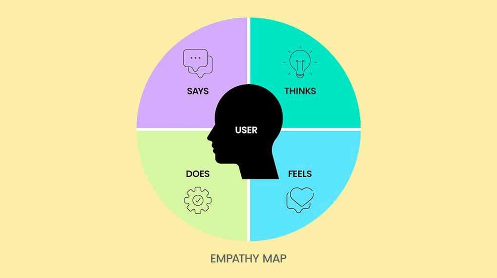
We also know you’re one of our best resources into how you want your audience to act and feel. You know your business best, so we involve our clients, and their customers, in the process too. This provides us with insights, and feedback, that are invaluable in creating effective and user-friendly website solutions.
When solving complex usability issues within enterprise websites, simplicity is key. The power of simplicity lies in its ability to enhance the user experience.
Modern web designs reduce complexity by focusing on what truly matters to the user–clear, concise, and straightforward interactions. Designing for simplicity and clarity, we strip away unnecessary elements to prioritize function, amplify focus, and improve website usability. The truth is simplicity only looks simple once it’s done.
A website isn’t done once it’s launched. Optimum performance requires continuous improvement — as well as ongoing web maintenance. Using data over intuition to enhance digital solutions is the smartest way to do that.

It’s important to regularly monitor website performance metrics and user interactions and gather data post-launch. This gives us the power to make informed adjustments to address any emerging complexities and enhance website usability. A website that’s underperforming is robbing you not only of present conversions but of the compound growth you could achieve in the future. If you increase a page's conversion rate even slightly, it will grow over time.
A content management system (CMS) is the backbone of your website; it’s the backend software that helps users create content, manage databases, and modify websites without writing code.
With various features and tools, a CMS can enhance website usability and offer a better user experience, internally and externally. Understanding the functionalities of different CMS platforms will help you find one that best complements your company’s content requirements. Ultimately, what CMS you choose depends on your business’s objectives and the goals of your customers.
One thing to keep in mind, you don’t want to choose a CMS based on personal preferences or opinions or stick to what you know. The only thing that’s certain at this point should be the objectives and the target audience, everything else will be decided from there.
When a website grows beyond its current capabilities, third-party platforms help to simplify the evolution. By leveraging external platforms, it’s possible to add new features, expand functionality, and enhance the user experience.
Most of the time, you can’t know at the start what kind of integrations your business will need in the future. It’s important to partner with an agency that can help you choose what is best for your business goals and audience needs. They’ll take the time to plan and document the integrations properly, considering long-term health and security, to avoid surprises and challenges down the road.
An experienced agency will likely also suggest regular review and testing schedules to catch and resolve integration issues before they escalate.
Ensuring third-party platforms, tools, and APIs seamlessly integrate with your existing website technology stack is essential for functionality. Some third-party platforms allow you to customize the tool to suit not just your business needs, but your users too.
When you successfully integrate third-party platforms, the website performance metric that’ll reap the benefits of these powerful extensions the most is your website usability.
Enterprise websites are not static; they’re dynamic and complex while looking deceptively simple from the outside — just like your large-scale organization experiencing growth. If you want to continue increasing your ROI, then create a scalable information architecture that prioritizes website usability, design and performance.
To continue to stay up to date with the latest in web design and development, scroll down to subscribe to our newsletter.
Receive exclusive action-focused content and the latest marketing insights.